What’s not to love about logo projects? There is so much promise in that little mark. The brand’s influential first impression is riding on the use of simple and smart design elements. The goal is always to say a lot by showing a little.
The process varies from designer to designer. I’ve worked with agencies that show up to 40 versions in a presentation. Others show options only in grayscale.
My process begins with complete immersion in messaging from the client. I get a lot of inspiration from words, so often, instead of sketching, I’ll brainstorm adjectives that associate with the positioning and strategy of my client. Next I choose typeface options and a color palette that all relate back to that desired brand impression. The logos start to take shape and cluster in literal marks that represent the product or service, and emotive marks that represent how the consumer feels when owning the product or using the service.

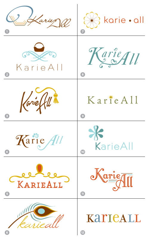
The 12 logos above were presented as a first round to client KarieAll. Karie, CEO and founder, is a handbag designer, whose creations are not only individual works of art, but practical in their form. Each purse includes a patented insert which makes it easy to transfer belongings from bag to bag. Karie’s aesthetic is about rich fabrics and adornments, and her business is about collectible luxury handbags.
The most challenging part of a logo presentation is not rooting too hard for one logo. A presentation should be well-rounded, well-executed, and paired with brilliant unbiased explanation. But the logos should also speak for themselves.
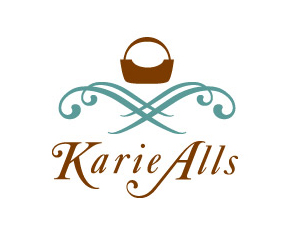
In following rounds of KarieAll, I explored a color shift and a typeface revision, and Karie chose this logo for her company:
 Generally I squirm a little when clients treat a logo presentation like a buffet. But I always try their suggested combination, because it is important to respect the client’s unique perspective. In this case, the parts from Logo 2 and Logo 4 reached a happy harmony.
I regret not having the opportunity to work on other elements of this brand as it launched. Part of the promise wrapped up in the final logo design is all that awaits for the brand’s look and feel. Its website, identity materials, packaging… That said, and for curiosity’s sake, feel free to visit Karie’s site and explore how this brand evolved.
How does your logo process unfold?